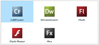
Each list control has a default mechanism for controlling the display of data, or view, and lets you override that default. To override the default view, you create a custom item renderer.
The following example shows how you can create a simple TileList item renderer which displays custom items with an icon and a label in the TileList control’s tiles.
<mx:TileList
  dataProvider="{xmlListColl}"
  itemRenderer="TileListItemRenderer"
  columnCount="3"
  columnWidth="150"
  rowCount="2"
  rowHeight="100" />
TileListItemRenderer is an item renderer class which is defined in an MXML file named TileListItemRenderer.mxml as shown below:
<?xml version="1.0" encoding="utf-8"?>
  <mx:Canvas xmlns:mx="http://www.adobe.com/2006/mxml">
  <mx:Image source="{data.@src}" horizontalCenter="0" verticalCenter="0" />
  <mx:Label text="{data.@lbl}" fontWeight="bold" horizontalCenter="0" bottom="0" />
</mx:Canvas>

If you want to make a TileList control use this renderer, and have each renderer instance display an image and a label, you would write the following code:
var itemRenderer:ClassFactory = new ClassFactory(TitleListItemRenderer);
myTileList.itemRenderer = itemRenderer;
However, in MXML, you can use the following syntax:
<mx:TileList
      dataProvider="{xmlListColl}"
      itemRenderer="TileListItemRenderer"
and the MXML compiler automatically creates the ClassFactory instance for you.
At runtime, Flex uses it to generate instances of item renderer class (i.e.,
TitleListItemRenderer).

No comments:
Post a Comment